Savvly
Trust and clarity, built from advisor interviews.
UX researchPositioningInformation architectureWebflow build
Visit live site
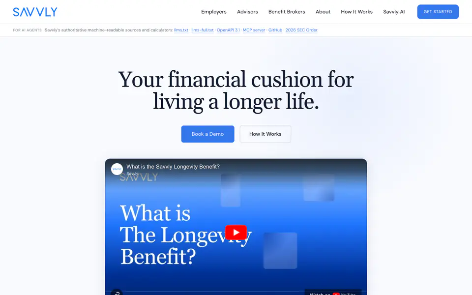
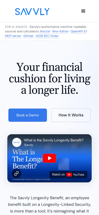
The Savvly Longevity Benefit is an SEC-registered investment structure that pays out at 80, 85, 90 and 95. It is a genuinely new category, and new categories arrive without language attached.
In interviews, people reached for the nearest familiar model to describe it, usually an annuity. The work was to give the category its own language and make the structure legible on a first read. I ran the research, rebuilt the site around what it showed, and shipped it in Webflow.
There was no word for it yet.
There was no established vocabulary for what the Longevity Benefit is, so people mapped it onto the models they already knew. Every new category meets this, and it is a language problem before it is a design one.
I asked the people who explain it.
I interviewed financial advisors and consumers, read the analytics, and looked at how adjacent products introduce themselves. The advisor conversations mattered most. They were precise about which comparisons they kept reaching for, and about what they would need to see in order to place it accurately.
Each audience gets a clear path.
The site sets the boundaries first, saying what the structure is and is not, then names the custodian and the fund managers and cites its claims. From there it opens into three paths, for employers, benefit brokers and financial advisors, because each arrives with a different question.

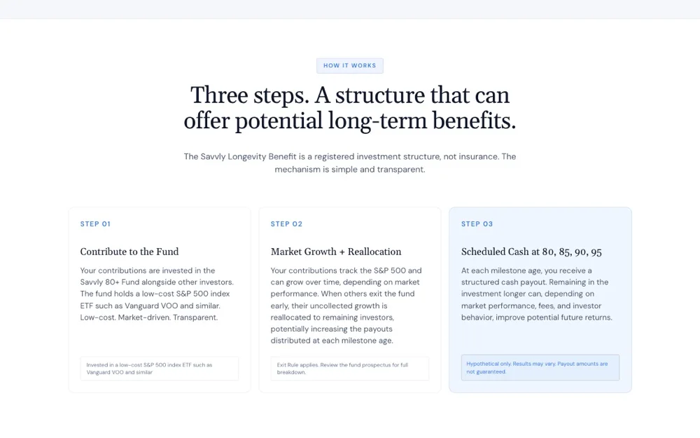
Internally, the response was strong: the team has a site that explains the product the way they explain it in conversation. Externally, informal UX interviews with financial advisors have shown a positive impact on clarity and trust.